How to Decode Food Labels:
What the Ingredients Really Mean
Think you're eating healthy? Think again.
Most Americans want to make better food choices. But they’re shopping in a world full of carefully worded labels, manipulated visuals, and half-truths. “Multigrain,” “organic,” “heart-healthy,” and “whole grain” all sound promising—until you flip the package over and look at what’s really inside.
That’s where the truth lives: on the ingredients list and the nutrition facts panel. The front is a sales pitch. The back is the reality.
Food companies know this and rely on the fact that most consumers don’t take the time—or don’t know how—to decode what’s actually in the food they buy. So they use vague terms, hide ingredients under alternate names, and emphasize health halos that distract from what's really in the mix.
Bread is one of the most misleading everyday foods. It can be dark brown, topped with seeds, and say “whole wheat” in big letters—yet still be made mostly from white flour with added coloring and sweeteners. These tricks don’t just affect bread—they apply across the entire grocery aisle, from breakfast cereals and “protein” bars to fruit juices and snacks.
In this guide, we’ll teach you how to decode food labels using bread as a clear case study. But once you learn these principles, you’ll see the same patterns everywhere—and you’ll have the power to outsmart marketing language and make choices that actually align with your health goals.
What Ingredients Lists Really Tell You
In the U.S., ingredients are listed in descending order by weight. That means the first ingredient is what the product contains the most of. It’s the single most important thing to check.
Reading the first three ingredients can often tell you 90% of what you need to know about a product’s true nutritional value. These are the dominant components and give insight into whether a food is made primarily of whole, nourishing ingredients or cheap, refined fillers.
Whole Wheat Confusion:
A product labeled “whole wheat” doesn’t have to be made entirely from whole wheat flour. In fact, many contain mostly white flour and only a touch of whole grain.
Watch for terms like “Made with Whole Grains” or “Honey Wheat.” These sound healthy but often use enriched (white) flour as the base.
Sometimes the “whole wheat” claim is based on adding a very small amount of whole grain flour just to qualify for the marketing term.
And don’t be fooled by rustic branding—brown paper packaging and artisan fonts are often used to create a false sense of wholesomeness.
✅ Look for: "Whole wheat flour" listed first, followed by simple, familiar ingredients.
❌ Avoid: "Enriched wheat flour" or generic "wheat flour" without the word whole, especially when combined with added sugars.
Dark Doesn’t Mean Healthy:
Bread that looks brown may not be whole grain. Molasses, caramel coloring, and malt extract are commonly used to darken the loaf without improving nutrition.
These ingredients add color without fiber or nutrients, giving the illusion of a heartier, healthier bread.
In some cases, white bread is made to look more nutritious just by manipulating color and texture.
To really know what you’re getting, look beyond appearance. A short, clear ingredients list with whole wheat flour at the top is your best bet for genuine whole grain bread—not the color, not the name, and not the packaging.
The Illusion of Healthy Bread
So why do manufacturers use white flour and not stick to the real whole grain?
Processing: White flour is easier to handle in machines. It blends smoothly into dough, supports consistent baking performance, and has a longer shelf life. In large-scale production environments, these factors are critical. It minimizes waste, speeds up production, and ensures a uniform final product.
Taste and texture: Many consumers have grown up eating soft, fluffy white bread. It’s associated with comfort, convenience, and neutrality in flavor. Whole grain bread, by contrast, is denser, more textured, and can have a slightly bitter or earthy taste due to the bran and germ. To appeal to the broadest market possible, manufacturers stick to what sells.
Profitability: Although refining flour removes nutritious components like fiber and vitamins, it allows for better shelf life and longer transport windows. White flour-based bread can sit on supermarket shelves or in distribution centers for weeks without spoiling. Additives and preservatives help ensure this longevity. That reliability is good for the supply chain—even if it’s not great for your health.
Perception management: Some manufacturers tweak the color or shape of the bread to make it look more wholesome than it really is. A brown crust, visible seeds on top, or the word “grain” in the name can make even a largely refined product seem healthy at a glance.
The result? Most supermarket breads are still white bread in disguise, cleverly engineered to feel nutritious while cutting corners on true whole food content.
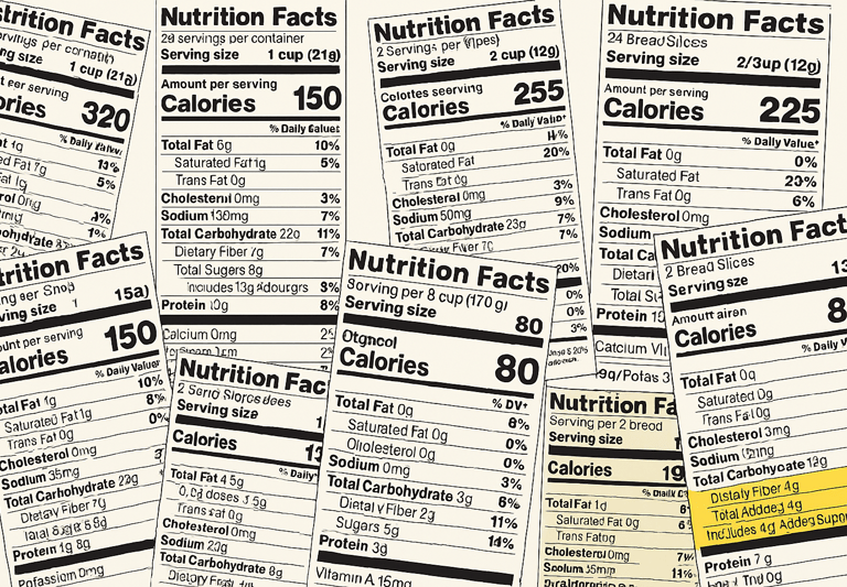
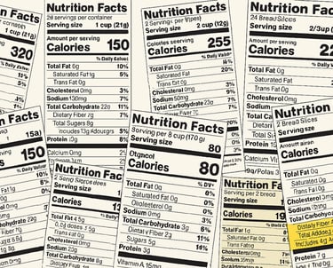
How It Works on U.S. Labels
The FDA requires manufacturers to list all ingredients in order of weight, and to provide a Nutrition Facts panel on packaged food. But that doesn’t mean they’re required to make it easy for you to understand. Instead, companies rely on marketing language to convince you something is healthy—even when the ingredients tell a different story.
Label claims to watch out for:
"Made with whole grains": This often means that a tiny portion of the product includes whole grains—while the rest is still refined white flour. It could be as little as 5% whole grain.
"Multigrain": Just means more than one type of grain is used. They could all be refined, processed grains with little or no nutritional value.
"Organic": Refers to how the ingredients were farmed, not how they were processed. An organic product can still be highly processed, high in sugar, or low in nutrients.
"Natural" or "All Natural": These terms have no regulated meaning under the FDA. They can be used on almost anything.
"Low fat": Sometimes means the product has added sugar to maintain taste and texture.
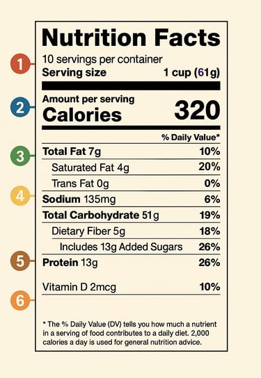
Let’s walk through the image above, step by step. The numbers on the left side correspond to the key parts of the label and what they actually mean:
1. Serving Size & Servings per Container
Why it matters: Every number on the label is based on this amount. If you eat double the serving, you’re eating double the calories, sugar, fat—everything.
Serving size: Defined by the manufacturer based on average consumption.
Servings per container: Tells you how many servings are in the full package.
Tip: Some brands reduce serving size to make their products look healthier.
2. Calories
Why it matters: This is the energy you get from one serving. It’s essential to track if you’re managing weight or energy intake.
320 calories per serving in this example.
So keep in mind that eating two or three servings can quickly add up.
3. Fats (Total, Saturated, Trans)
Why it matters: Not all fats are bad, but excess saturated and trans fats can increase the risk of heart disease.
Total fat includes all fats: healthy (unsaturated), saturated, and trans.
Saturated fat should be limited to <10% of daily calories.
Trans fat ideally should be 0g. Even “0g” can hide up to 0.5g per serving if the ingredient list includes “partially hydrogenated oils.”
4. Sodium, Carbs, Sugars & Fiber
Why it matters: This section reveals the blood sugar and heart health story.
Sodium (salt): 135mg is moderate, but it adds up fast. Too much raises blood pressure.
Total Carbohydrate: Includes both complex carbs and sugars.
Dietary Fiber: 5g is solid—fiber slows glucose absorption and improves gut health.
Total Sugars: Including 13g of Added Sugars. These raise blood sugar quickly.
⚠️ Watch out for: Anything above 6–8g added sugar per serving in bread, yogurt, or cereal is usually too much.
5. Protein & Micronutrients
Why it matters: This section gives a quick snapshot of protein and essential vitamins/minerals.
Protein: Important for muscle, satiety, and blood sugar balance.
Vitamin D, calcium, iron, potassium: Usually listed here if present in meaningful amounts.
If a product makes strong health claims but contains <3g protein and <2g fiber, be skeptical.
Nutrition Facts Panel – What to actually look at
Focus on the Total Carbohydrates section, but pay close attention to:
Added Sugars: This line is legally required and shows whether extra sweeteners have been added, even if they go by less familiar names.
Dietary Fiber: This is a strong indicator of whether whole grains are truly present. A real whole grain product should give you at least 3g of fiber per serving—more is better.
Serving Size: Many products reduce their portion size to make sugar or calorie counts appear lower. Always check whether the serving size reflects how much you’d actually eat.
Understanding the label means going beyond the headline claims and learning to interpret the small print. That’s where the truth lives—and it’s the key to avoiding common traps.
Hidden Sugars and Misleading Names
Brands know that “sugar” looks bad high up in an ingredient list. So they break it down into smaller parts to make each one seem less significant. Instead of listing “sugar” as a top ingredient, they may use three or four types of sweeteners spread throughout the list, avoiding alarm bells but still delivering the same sweet punch.
Watch for:
Dextrose
Glucose
Fructose
Maltose
Cane sugar / cane juice
Molasses / honey / brown rice syrup
Corn syrup / high-fructose corn syrup (HFCS)
Fruit juice concentrate
Agave nectar
These sweeteners may appear low on the list individually—but combined, they can make up a large percentage of the product. They’re used in everything from sandwich bread to salad dressings, often in foods marketed as healthy.
Food companies may also add natural-sounding ingredients like “evaporated cane juice” or “organic honey” to reinforce a wholesome image, even though the effect on blood sugar is virtually identical to refined sugar.
Visual Trickery:
Granola bars often show nuts and oats but are glued together with syrups, making them closer to candy bars than breakfast.
Yogurts labeled “light” may reduce fat but replace it with sugar or artificial sweeteners like sucralose or aspartame.
Smoothies, juices, and plant-based milks often appear clean but are frequently sweetened to enhance flavor.
Red flag: If sugar (or its aliases) appears more than once, it’s a clear sign that the manufacturer is hiding total sugar content across multiple ingredients. Always scan for repetition and check the “Added Sugars” line on the nutrition panel to verify the true sweetness load.

How to Read This Nutrition Label
The Psychology of Packaging: Why It Works
When you walk into a supermarket, you're not just shopping for food — you're stepping into a carefully curated marketing environment. Every box, bottle, and bag has been designed to make you feel something: trust, comfort, health, indulgence, or even nostalgia.
Food packaging psychology is one of the most subtle and effective tools companies use to influence buying behavior — especially when it comes to products like bread, snacks, and breakfast foods that are marketed as "healthy."
Let’s break down how this works:
1. Color Psychology
Color isn’t just visual — it’s emotional. Brands deliberately choose colors to signal health, naturalness, or indulgence.
Earth tones like brown, beige, and green suggest that the product is wholesome or organic.
Bright yellows and reds are often used for processed snack foods, triggering excitement and impulsivity.
Dark brown packaging may mimic the color of whole grain bread, even if the bread inside is not whole grain at all.
Example: A loaf of bread in a brown bag with beige and green print may look “rustic” and healthy — but flip it over and you may still see “enriched wheat flour” and “sugar” in the first three ingredients.
2. Imagery and Iconography
Visual cues matter. Photographs or illustrations of grains, fields, barns, or wheat stalks create the illusion of traditional craftsmanship — even for highly industrialized products.
Bread packaging might show whole kernels or cracked wheat, even if only a fraction of the product contains real whole grains.
“Farm fresh” eggs or vegetables on a box of processed crackers subtly suggest nutritional quality through association — even if those ingredients are barely present or totally absent.
Deceptive visual cue: Seeing a picture of oats and almonds on a granola bar doesn't mean it’s mostly oats and almonds — it could be sugar and syrup held together with a few flakes and nuts.
3. Buzzwords That Build Trust
Front-of-package words are not always factual — they’re persuasive.
Here are common terms used to create a health “halo,” even when the underlying product isn’t all that healthy:
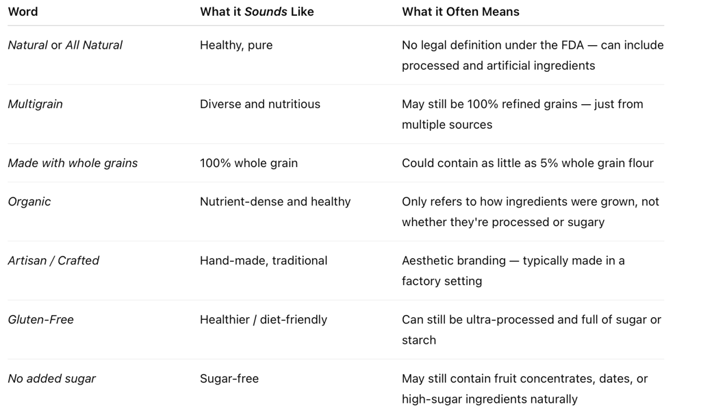
These buzzwords are legally permissible but often misleading. They rely on connotation, not clear definitions.
4. Fonts and Typography
Even the way a word looks can sway your perception.
Script fonts feel hand-written, suggesting small-batch or artisanal production.
Bold, clean fonts suggest authority and transparency.
Rustic typefaces mimic chalkboards or handwritten labels — common in farmer’s market branding.
These design choices prime you to associate a product with trustworthiness, simplicity, and tradition — even if it’s mass-produced, sweetened, and preserved.
5. Texture and Packaging Materials
Some brands use matte, recycled-looking packaging or “kraft paper” design — even when the material isn’t actually recyclable — to evoke minimalism and eco-friendliness.
The tactile feel of packaging (paper vs. shiny plastic) also affects how “real” or “premium” a product feels in your hands.
Why It All Works: Cognitive Shortcuts
Psychologists call these strategies heuristics — mental shortcuts we use to make fast decisions without analyzing every detail.
When you're busy, tired, or hungry, you don’t want to spend five minutes reading fine print. Instead, you might:
Trust the front of the package.
Recognize a brand you’ve seen on social media.
Choose the product that looks healthier based on color and layout.
Feel safer choosing something labeled “organic,” even without checking the ingredients.
Food companies understand this — and they design packaging to exploit these shortcuts.
Bottom Line
The front of the package is marketing. The back of the package is the truth.
When choosing bread, bars, cereals, or other packaged foods, always ask yourself:
Does the packaging feel “rustic” or “natural”? Why?
Are there buzzwords on the front — and what do they really mean?
Does the branding distract from what’s actually in the food?
Flip it over. Read the ingredients list and nutrition panel. That’s where the story of your food is actually written.